You’ve likely had this experience: You’re filling out an online form, answering question after question, until finally you’re at the end. All that’s left is for you to push the Submit button. And then: error 404. Something went wrong, and you have to fill out the form all over again.
This is a classic example of bad form user design (UX). Chances are, the website designer made a crucial mistake. Maybe the form wasn’t tested properly, or maybe it misidentified an entry. Whatever the reason, an error like this can mean a customer eager and willing to sign up for your newsletter, answer a survey, or order your product leaves without doing so.
This article offers a roadmap for ensuring good form UX for your ecommerce website.
What is form UX?
Form UX is the practice of designing online forms that are easy to understand, fill out, and complete. Forms with good UX feature straightforward questions, clear instructions, intuitive design, and guidance for users as they complete and submit key data to your business.
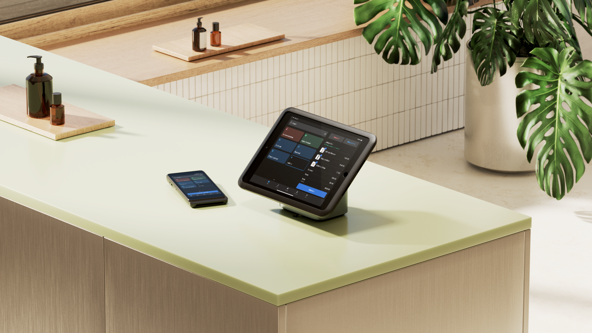
For ecommerce businesses, forms are one of the touchstones of how customers and partners engage directly with your business online. Website forms are used for submitting customer questions, processing orders, restocking inventory, gathering contact data, and receiving direct feedback from customers.
Common form types include email signup forms, contact forms, B2B forms, and more complex forms like shopping cart checkout flows and customer feedback surveys. These forms essentially function as the information delivery system to and from your business. Good form UX makes this process as seamless and error-free as possible.
Key aspects of form UX
Good forms balance the interconnected needs of user experience (UX), user interface (UI), and business goals—whether that’s increasing sales, processing feedback, or collecting customer data. While form UX is often used as a blanket term, it consists of several core components that work together to facilitate the user experience:
-
Content and flow. The form’s information architecture. This is how content and questions are selected, grouped, worded, and paced so that the form flows smoothly from start to finish.
-
User experience and accessibility. Elements that enhance the user’s experience and ability to fill out the form, such as clear labels, easy-to-follow instructions, helpful microcopy, and streamlined questions.
-
Visual layout and design. The form’s UI design, including easy-to-read typeface, good spacing, page layout, and aesthetic choices that make the form easier and more pleasant to fill out and complete.
-
Interaction design and feedback. Helpful user guidance throughout the form-filling process, including smart defaults, and real-time feedback such as validation checks, error messages, and confirmations.
Form UX best practices
- Keep it short and simple
- Separate your form into logical groups
- Favor multipage forms
- Use a single-column layout
- Design for diverse screen sizes
- Customize your autocomplete and autofill options
- Speak to user concerns
- Simplify the checkout process
- Beautify your form design
From keeping your form streamlined to designing with a range of screen sizes in mind, here are some best practices to follow as you experiment with form UX:
Keep it short and simple
The longer your form is, the more you’re at risk of losing customers and conversions. Especially for longer forms like shopping carts, customer feedback, and contact forms, go through the form question by question and ask: Do I need this information, and can I get this information more easily another way? If the data isn’t required, you should clearly label it as an optional field or consider deleting it altogether.
A good approach to reducing question clutter is to combine different form fields. For many ecommerce transactions, you can combine clunky fields like “Prefix,” “First Name,” “Last Name,” and “Suffix” into a single “Full Name” field, all on the same line. This particular solution is much easier for users with names that don't fit into a rigid “First Name/Last Name” structure, such as customers with multiple surnames.
Separate your form into logical groups
When designing your form, make sure your form fields are logically grouped. Most forms order their questions using common conventions that are immediately recognizable; for example, a customer’s name, followed by their street address, country code, phone number, and so on. How additional questions are included, though, has a large impact on the user’s experience. A good UX practice is to group form fields so the form as a whole flows naturally for your users, without unexpected questions that may raise red flags.
Favor multipage forms
A popular approach to separating different form categories is to use a multipage form layout, where a user progresses between different sections using Back/Next buttons. This approach has the advantage of being familiar and visually clean to many users, and is standard for shopping carts and longer forms. While some UX and UI experts argue in favor of forms with single-page layouts, multipage form layouts are by far the norm, and should be considered a default option for most ecommerce businesses.
Use a single-column layout
Forms that use single-column layouts are easier on the eye and more intuitive for most users. The layout’s vertical format mirrors the downward direction of the user’s eyes as they fill out the form, particularly on mobile devices that are held vertically. Platforms that use multi-column form layouts run the risk of cluttering the screen and can look radically different on diverse screen sizes. This is especially true for smaller screens, which usually can’t fit more than one form field per row.
Design for different screen sizes
Ensure your form is accessible on desktop, tablet, and mobile devices. Mobile use has skyrocketed over the past decade, with recent studies showing mobile internet use breaching 60% of the global market. To make sure your form works on all platforms, run tests on different screen sizes. Your forms should be readable and fit cleanly on the screen, no matter the size. Many ecommerce businesses have mobile-only versions of their websites as well, allowing them to customize the mobile experience more directly.
Customize your autocomplete and autofill options
There’s no quicker way to speed up the form-filling process than by using autocomplete and autofill. Autocomplete functionality is a standard feature of Shopify Forms and most other form templates, and can drastically reduce the time it takes for customers to complete your form, drawing on and inputting data already saved in the user’s device. This usually reduces the frequency of data entry errors as well, ensuring that input fields are correctly filled with saved data and fewer typos that result from manual data entry.
Speak to user concerns
In a survey by Manifest tracking online behavior, “security concerns” is cited as the most likely reason that people abandon filling out a form. This isn’t surprising; filling out forms requires a level of trust and can put the user in a place of vulnerability. Speaking to these concerns is a good way to improve the customer’s experience and increase conversion rates.
When your form asks a question that may raise a red flag, a good approach is to explain why you’re asking the question. If users have expressed privacy concerns, indicate on the form how the data will be used. If your business doesn’t sell private data, make a point of saying this explicitly above the form field, using clear, non-legalistic language.
Simplify the checkout process
The complexity of your checkout flow can dramatically determine cart abandonment figures. Surveys from the Baymard Institute measured that, on average, more than 70% of carts are abandoned without any purchase. Fortunately, there are some ways to simplify the checkout process. Ecommerce businesses can use checkout platforms that accept multiple payment options, autofill user payment information, and verify credit card numbers in real time using Luhn validation algorithms. If conversion rates remain a concern, however, consider offering expedited options—guest checkout and express checkout options have the disadvantage of gathering less data from your customers, while potentially reducing cart abandonment rates. Shopify Checkout offers all these features, with extra customization options for form fields and confirmation messages available for Shopify Plus subscribers.
Beautify your form design
While most form templates have their own style and design, use your own judgment—and feedback from your customers and colleagues—to make sure the form works well with your website, and agrees with your own visual aesthetics.
When modifying form design, consider the following:
-
Avoid placeholder text. Placeholder text is the gray text suggestion that displays inside form input fields. It can look nice, but it’s often hard to read, and it unhelpfully disappears once a user fills in text.
-
Combine multifield answers. Combining input fields into one field simplifies the form-filling process and creates a cleaner look with fewer boxes.
-
Use vertical lists. Vertical lists, checkboxes, and radio buttons are easier on the eye than horizontal lists and mirror the user’s journey from top to bottom of the screen.
-
Place labels above each form field. Labels on top of form fields look more natural than labels off to the side, and similarly mirror the user’s journey.
-
Match the size of form fields to their answers. Use form field sizes that feel natural for the answers you expect, so that most answers fit comfortably inside the width of the text field.
-
Use legible fonts. Consider serif fonts with high x-heights (the distance between the base line and the mean line—roughly equivalent to the height of the letter x), such as Helvetica or Roboto, to make your forms easily readable.
How to test your form UX
There’s no replacement for testing your forms in real-world environments. A form that appears to work smoothly on your desktop computer can fail for any number of reasons—confusing labels, slow load times, or clunky error messages can all deter customers and lower conversion rates. Your goal should be to test and verify that your form functions properly in the majority of computing environments, and that it helpfully guides and anticipates the user behavior of your customers.
Begin by combining technical checks with usability testing, then follow up your results with data and feedback from real users:
-
Test for different screen sizes. Test out the form on common devices to make sure fields, tap targets, and pop-up keyboards work on all devices, from smaller mobile phones to high-resolution desktop screens.
-
Test for speed. Record load times and responsiveness for your form, measuring its performance using slower connection speeds and older devices.
-
Test with real users. Ask real users to use the form in quick sessions, taking note of where they hesitate or hit roadblocks.
-
A/B test after launch. After launch, create variations of your form—such as by changing question ordering, or swapping button styles—to see which version, if any, is more successful.
Form UX FAQ
What are the golden rules of UI design?
The golden rules of UI design are a handy guide and checklist for implementing good UI design. The rules are: seek consistency and universal usability, offer helpful feedback, design dialogs to yield closure, prevent errors, enable users to undo their actions, keep users in control, and don’t force users to rely on their short-term memory.
What are the three guidelines for designing forms with good UX?
The three guidelines for designing forms with good UX are: keep your form focused by avoiding unnecessary content, make your form easy to complete with clear language and good flow, and provide instructions to help users complete your form successfully.
What are the seven pillars of UX design?
The seven pillars of UX design are a commonly referenced checklist for assessing the UX experience from the perspectives of both the user and the business. The seven pillars are: useful, usable, findable, credible, desirable, accessible, and valuable.